2023 Gallery
Winner: Best Identity Design
Principle Design for Kōri Ice Cream
659 Glenferrie Rd
Hawthorn, VIC
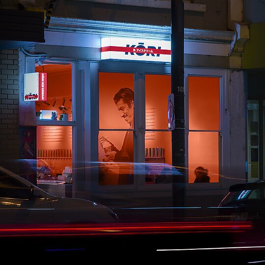
‘Present Kōri Ice Cream as an inviting and everyday option with an elevated edge’ – a simple brief that required robust design thinking to carve out and refine the ideal consumer perception. A new concept for Melbourne, this Japanese gelato hybrid demanded a brand as groundbreaking as its menu.
Jury Citation
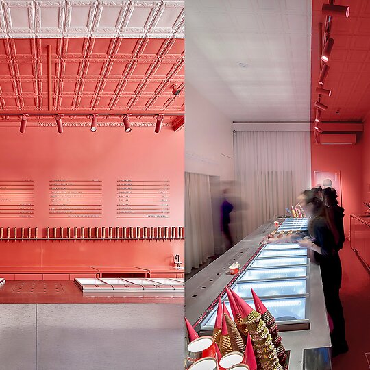
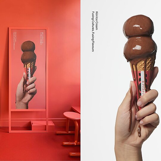
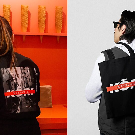
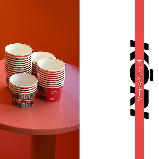
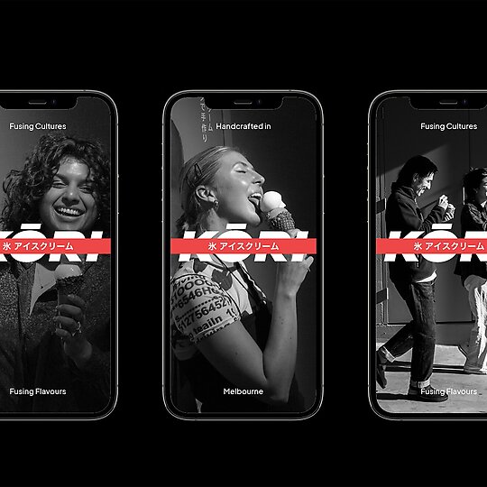
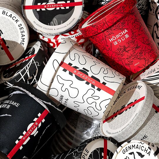
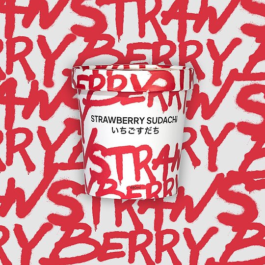
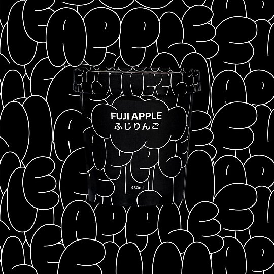
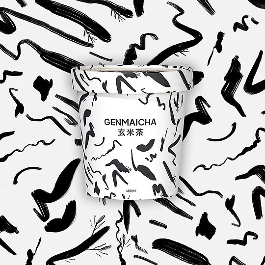
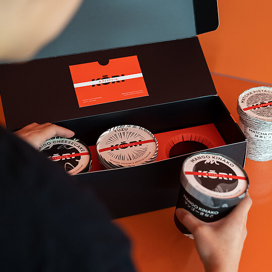
Kōri Ice Cream exemplifies what’s possible when branding and interior design minds work synergistically. Principle Design’s street-style-inspired identity is not only successfully applied throughout interior, wayfinding and packaging, it is thoughtfully executed at all levels. It wouldn’t be surprising to find a red stripe on the inside of a waffle cone (spoiler: there isn’t one). What is particularly refreshing about Kōri is that it eschews expected ice-cream aesthetics. It is street rather than sweet; bold rather than cute. The identity blends contemporary typography with punchy graphic devices, bespoke illustrations and photography. On paper, this sounds like “too much,” but in practice – and in the context of Kōri’s simple yet impactful interior – it works. There’s a sense of fun in the flavour-specific tub designs (that entice you to try them all) and the giant dripping ice-cream image in-store. The branding experience is memorable, caters to small and big kids alike, and leaves all with a smile.
