2016 Gallery
Winner: Best Identity Design
Peculiar Familia for Pink Moon Saloon
South Australia
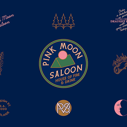
An imaginary mountain refuge in the heart of Adelaide’s CBD, curiously inspired by the American National Parks movement and Japanese design principles. A brief that could have gone anywhere, but led to here.
Jury Citation
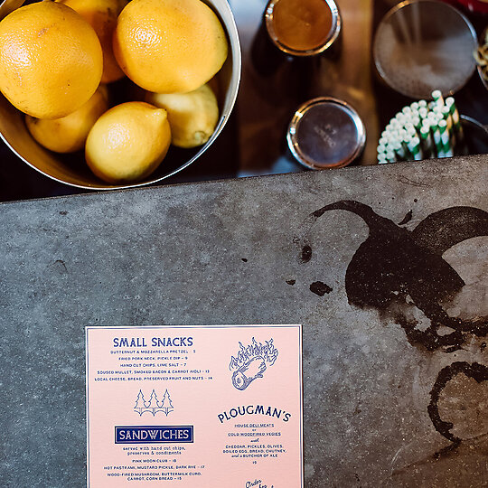
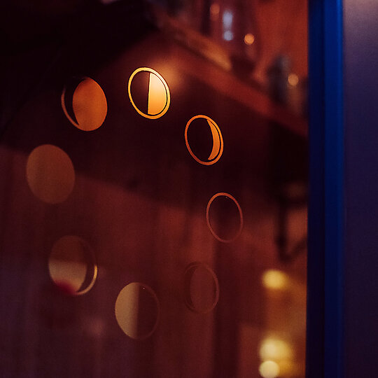
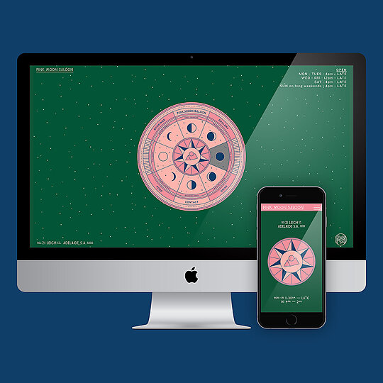
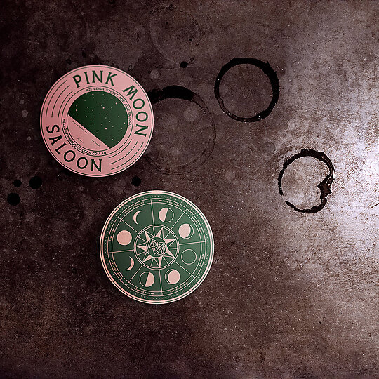
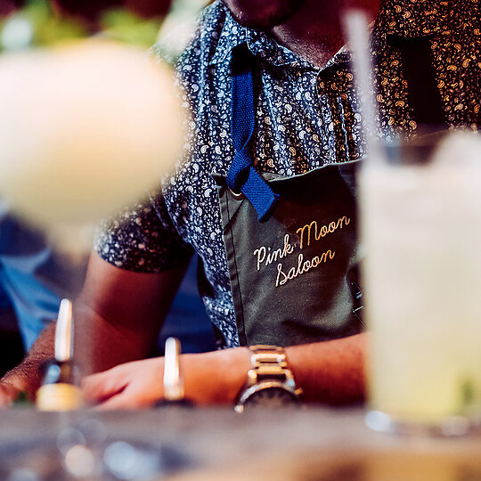
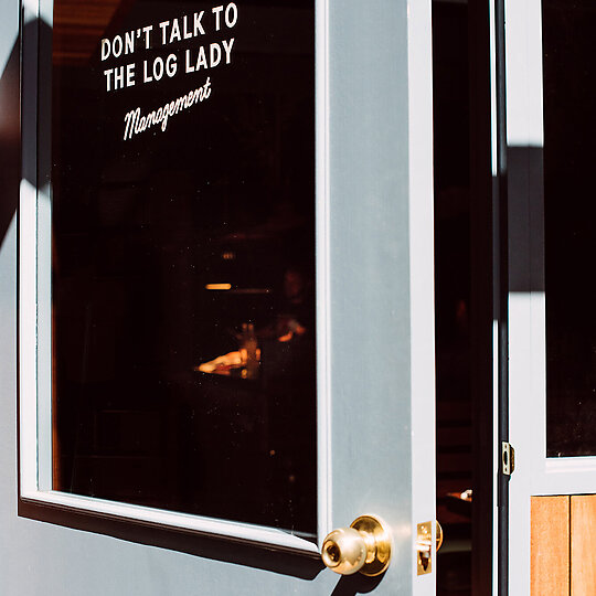
The stunning success of Pink Moon Saloon is a result of a fully integrated vision for space, architectural form and visual and graphic identity. From the profoundly simple logo, which is comprised of the archetypal pink moon positioned over an abstraction of the architectural form of the venue, to the use of typography and graphics throughout the venue, the overall impression is of playfulness and lighthearted celebration. The design studios quirky stated influences the American National Parks movement and a Japanese design sensibility are discernible, but ultimately they have been transcended in the final product.
At a time when joy is a hard quality to find, Pink Moon Saloon dishes it up in spades. The use of graphics is innovative yet deceptively simple and direct. Perhaps most importantly, the project is infused with a sense of happiness and cheeky fun that won the jury over. Considering the modest budget, the scope of the projects ambition is truly breathtaking. The design team have taken a great risk here, with minimal resources, and it has paid off.


