2014 Gallery
Winner: Best Retail Design
Richards & Spence for The Standard Market Company, Gasworks Newstead
Queensland
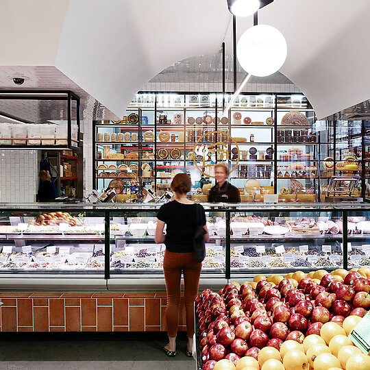
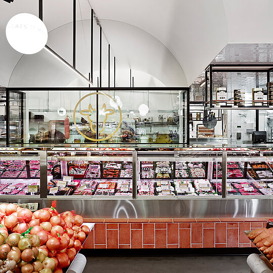
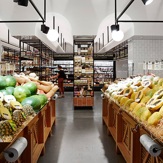
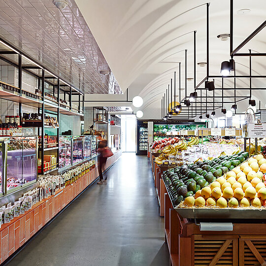
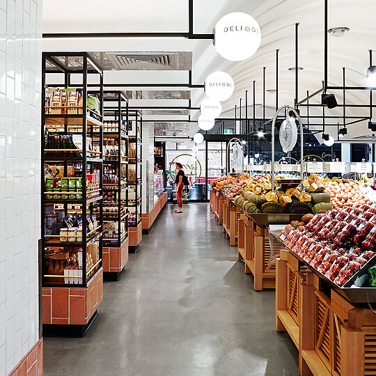
The design for The Standard Market Company appropriates the legacy of traditional central city markets, both formally and materially. Lofty vaulted interiors; immediacy between food production and food sale; and the presentation of the food itself are fundamental to an authentic market environment.
Jury Citation
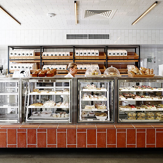
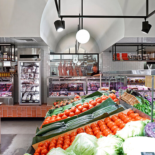
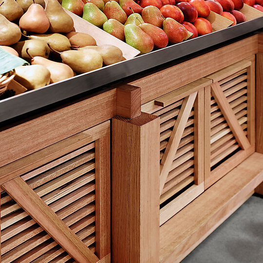
With its uplit vaulted ceiling, terracotta floor tiles, white glazed wall tiles and abundant displays of fruit and vegetables piled high on tables modelled on old wooden trestle tables and fruit crates, The Standard Market Company consciously nods at the traditional.
But there's a modern sensibility at work too at this third outpost of the Queensland food market that incorporates a butcher, a baker, a deli and a green grocer.
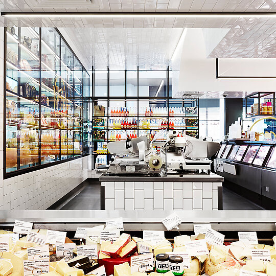
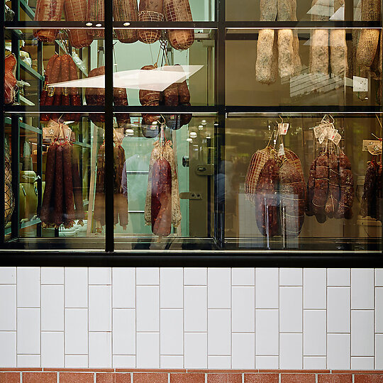
Glazed cool rooms are stacked full of cheese and hanging meats, while butchers and pastry chefs work behind glass, all tapping into current obsessions with the theatre of fresh food production and the desire for immediacy between food production and sale.
This blend of traditional and modern creates a thoroughly attractive tension in the space so that the store feels both large and intimate, sophisticated and modest.
The design is also refreshingly straightforward, clearly focused on the product but in clever, theatrical, entertaining ways the arched ceiling, the integrated lighting, the sausage-making butchers - that make it an ideal template for how attractive and efficient food retailing can be.
DESIGN STATEMENT
The Standard Market Company is a new food market for a single operator incorporating a butcher, baker, delicatessen and green grocer. The market is located within a recently established mixed-use development, Gasworks Newstead.
Our client's existing market retail offerings at James Street in Brisbane and Ferry Road on the Gold Coast have already established The Standard Market Company as the go-to people for fresh food and their identity is now heavily referenced within the recent fitouts of significant supermarket chains.
The existing stores are located within buildings designed specifically to operate as market places. In contrast, the Newstead tenancy consisted of a generic retail envelope with sheer glazed frontages, a horizontal ceiling, dual customer access and limited direct dock access to back of house.
The design of the new market fitout needed to overcome the constraints associated with retro-fitting a market use within a conventional office/retail development, while redefining their brand as a fresh and cohesive retail identity which would competitively differentiate their business within its new mixed-use setting.
The successful outcome was achieved through ongoing collaboration with the client to establish a detailed understanding of their business operations and the inherent opportunities for spatial planning and detailed design.
