2014 Gallery
Winner: Best Installation Design
Ruined City Pty Ltd for coffee PEDDLR
Victoria
coffee PEDDLR seeks to provide a designed, versatile and functional cafe environment which, although temporary and mobile in nature, engages with customers in a friendly and theatrical manner - conducive to repeat patronage, and in keeping with the quality product on offer.
Jury Citation
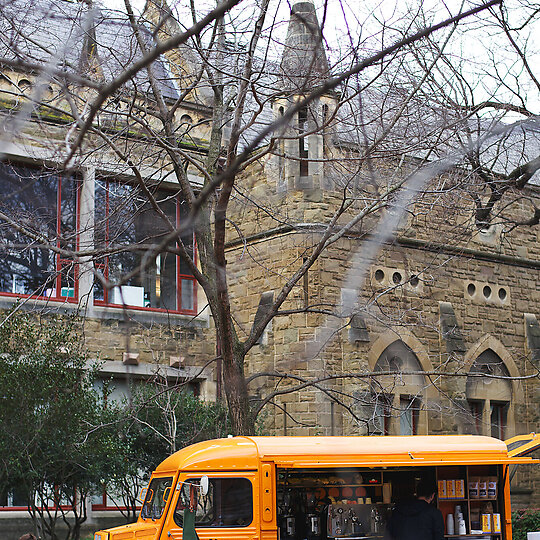
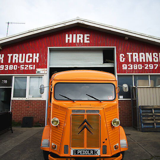
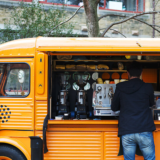
This cheerful ray of sunshine coffee van perfectly encapsulates what the Best Temporary Design category is all about the innovative ways in which hospitality can be delivered.
The quirky retro good looks and eye-catching colour give Coffee PEDDLR's retrofitted Citroen H van an almost instantly iconic impact and signals a sense of humour and fun, but the highly efficient and sympathetic reinvention of the van also ensures that it's able to deliver a product that meets the exacting standards of today's coffee drinkers.
One of the most impressive features of the van is the use of materials like plywood and vinyl flooring that are not only necessarily light and hard-wearing but that also mirror the H van's design aesthetic and are coupled with the history of the Citroen workhorse.
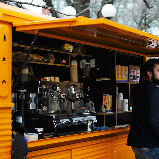
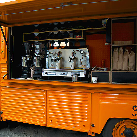
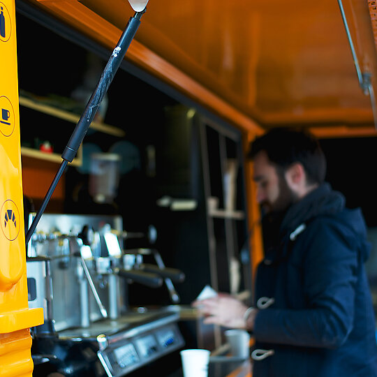
Folding awning and opening panels provide the practical advantages of shelter and access, while also underlining the playful, toy-like nature of the van, further underlining this mobile business's very distinct and very unique personality.
DESIGN STATEMENT
The brief called for a versatile beverage and food space which would be functional, highlight product and intrigue patrons. The challenge with retrofitting a vehicle was the inherently limited space (approximately six square metres) both vertically and in plan.
The spatial constraints meant that the layout had to efficiently provide elements of food preparation, service theatre and stock display, while being completely self-sufficient for power, water and waste handling.
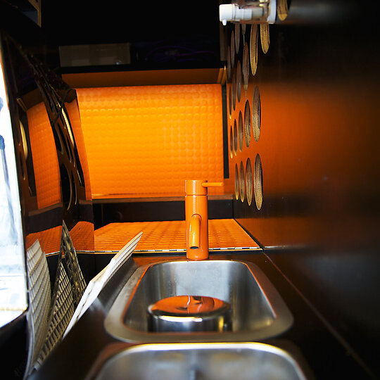
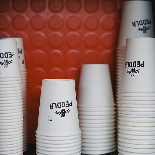
Material strategy was informed by the utilitarian history of the van - formwork plywood, vinyl flooring, and tactile floor/wall coverings not only hint to the van's past, but double as smooth and impervious surfaces.
In this way, weight, quantity and cost of material layering was minimized. FSC-certified plywoods were used and a van, which was otherwise near the end of its functional life, was reinvented.
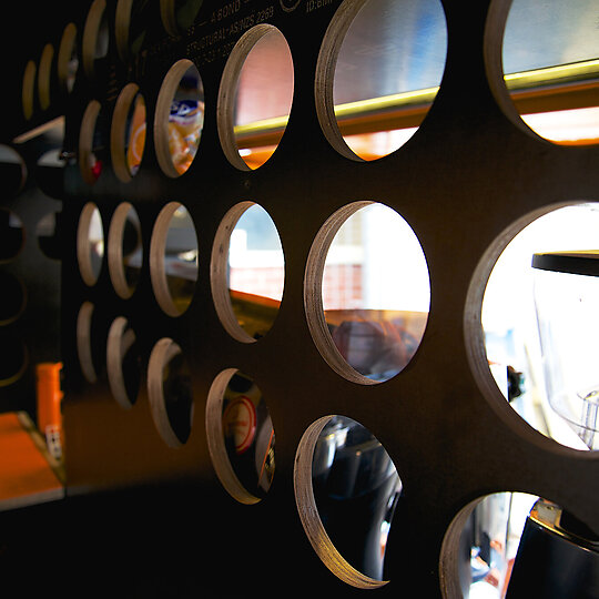
The materials, by way of colour scheme and circular cut-outs taken from the main logo, tie into the branding developed for the van. Additionally, visual permeability is enhanced to facilitate communication between different areas and provide a depth and backdrop to the coffee station.
