2014 Gallery
Winner: Best Identity Design
Inhouse for Seafarers / Ostro
Other
An identity system for the rejuvenated Seafarers Building in Auckland’s Britomart precinct where OSTRO is the flagship restaurant. The building’s rich history as Auckland’s Sailors Home provided the basis of the nautical themed branding which is applied through pattern and a limited colour palette.
Jury Citation
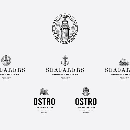
Seafarers, a recently renovated building located on Auckland's harbour front, has a strong maritime history (it once housed the Auckland Sailors Home) which has been cleverly reflected in its visual identity, not by way of logos but through a quieter, more organic graphic language that riffs on both geometric maritime flags and etching-like drawings of classic nautical imagery.
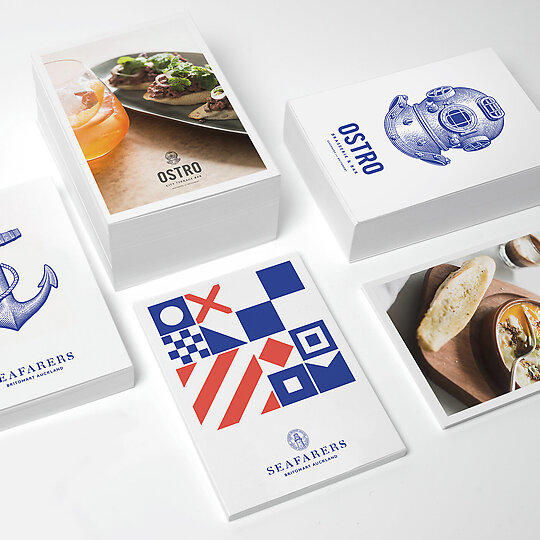
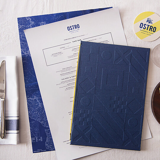
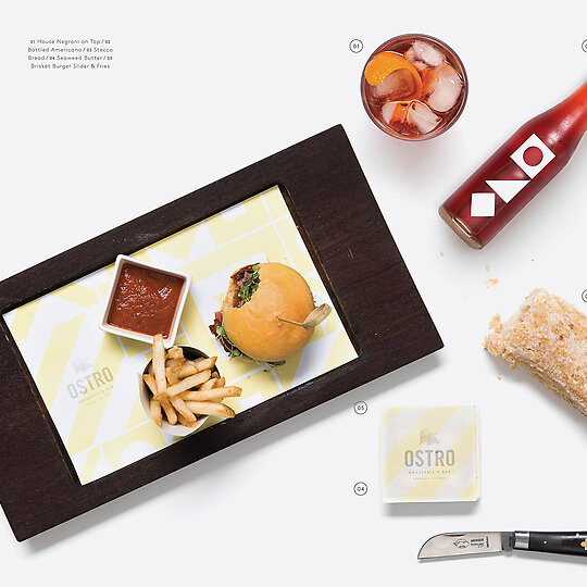
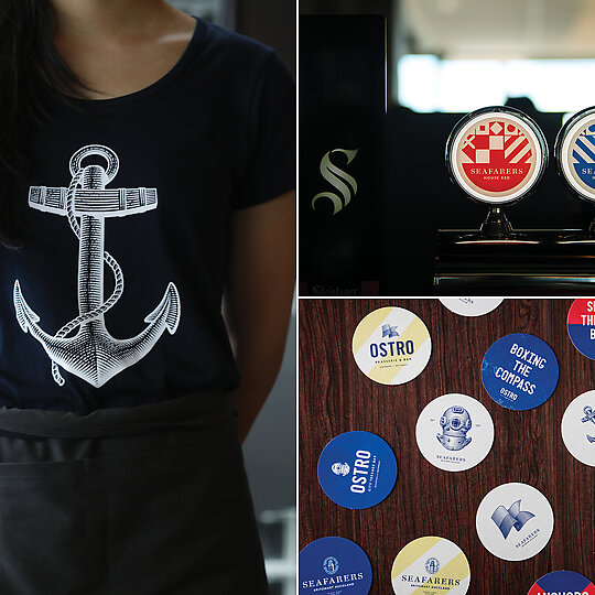
One floor of the seven-storey Seafarers building is currently occupied by Ostro restaurant and bar, which uses the imagery on everything from menus and coasters to butter paper and the covetable T-shirts and aprons worn by the staff.
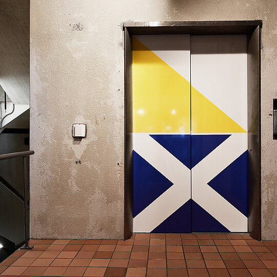
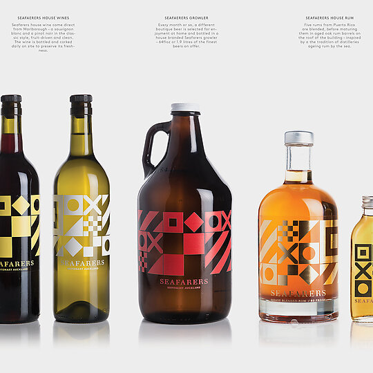
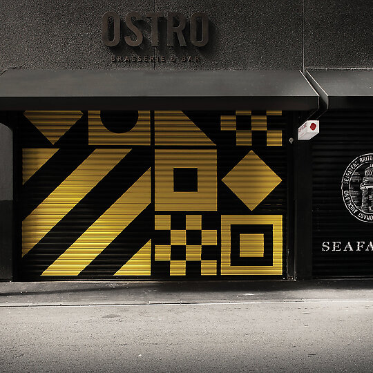
Eventually the building will house a series of hospitality businesses on every floor and the diverse but consistent visual design that's painted on the street-level roller doors and lift doors, printed on labels for house wine and spirits and used for bathroom signage and beer tap lenses is strong, fresh and flexible enough to successfully encompass these future endeavours.
It's a refreshingly fun, bright and clever design with a strong sense of both purpose and playfulness.
DESIGN STATEMENT
Seafarers is a recently rejuvenated seven-floor harbour-front building located in Auckland's Britomart precinct, which house's Michelin-starred chef Josh Emett's flagship restaurant Ostro.
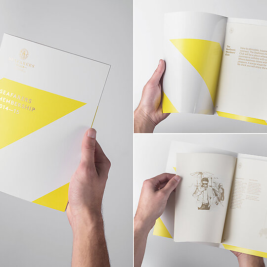
The brand identity draws on the building's rich nautical history as Auckland's Sailors Home and its recent contemporary renovation. An illustrator was commissioned to create a set of traditional etching-like nautical details and these were paired alongside bold geometric patterns inspired by maritime signal flags.
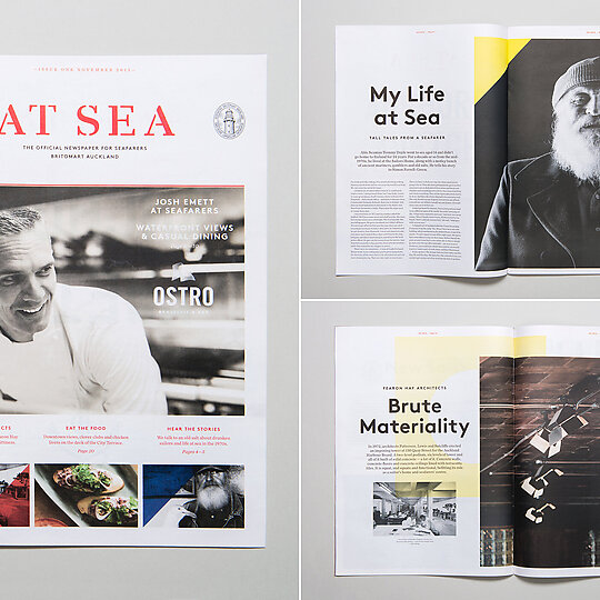
The designers wanted to make a distinctive contrast of two different aesthetics that were bound by a shared maritime theme. The designers continued this juxtaposition in the typography by using a variety of classic and newly-released typefaces.
Mixing the past and present references the heritage of the building and its new contemporary use. The identity is applied to many of the touch-points throughout the building - everything from elevator doors to the house rum.
